How Visual Design Takes Filipino Themes as Design Inspiration
By Jay Quilanita and Patrick de Jesus
In graphic design, having inspiration makes it easier to build your idea. Researching for design inspirations or references is important because they help a lot in the conceptualization process. Inspiration serves as an anchor to how you want to go about with your design executions and how you can expand the idea to different forms of medium.
The things you can draw inspiration from are infinite. One can find inspiration from personal experiences, real-life stories, existing pieces of works, events, and even from various cultures. In the Philippines, one of the most common themes or inspiration for graphic design is its culture — the Filipino culture — especially during the month of August where the country celebrates its language and the pride of being Filipino. But how do you make your design stand out during this time when literally everyone is creating a design based on the same theme? Let me share with you some Filipino-inspired designs I’ve crafted through the years of being a graphics artist.
It’s hard to create something unique when a theme is pretty much overused like the theme on nationality. But just because many will be using the same concept at the same time, doesn’t mean it should stop there. With all the existing Filipino-inspired designs today, an important question to ask before attempting to create it is: What are we going for here? What elements should I use for it to be truly Filipino?
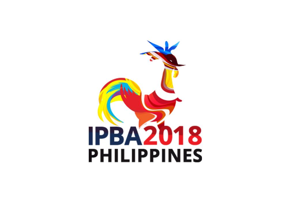
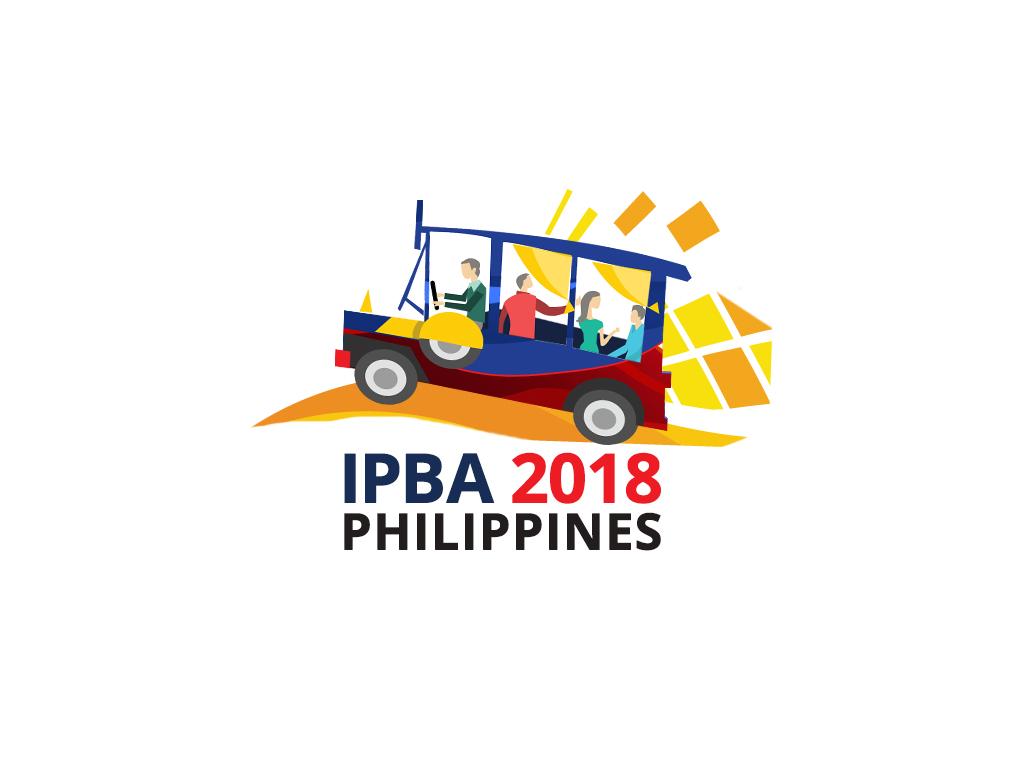
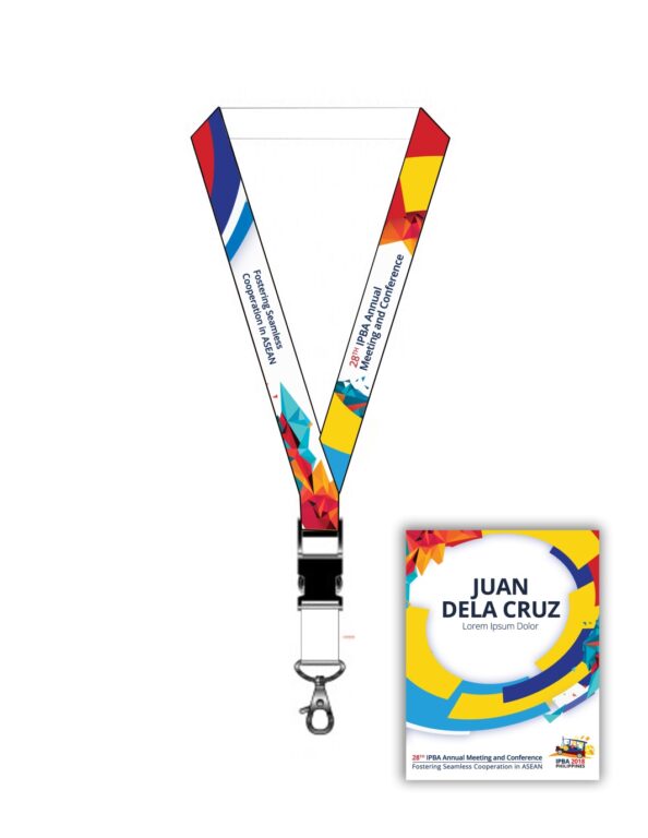
One of the first projects I did was for the 28th Inter-Pacific Bar Association (IPBA) Annual Meeting and Conference, also known as the IPBA 2018 Manila. It is an international conference that brought together lawyers and law practitioners from over 60 jurisdictions of the IPBA organization around the world to discuss and dissect legal trends, opportunities, and challenges brought by the ASEAN integration. More than getting people to register for the event, our goal was also to promote the Philippines as a destination for the delegates to register for and fly to.
When I thought about how to design the key visual for this event, I wanted it to be more than just using the Philippine flag colors, I wanted it to reflect something that’s uniquely Filipino — something about our culture that tells our rich story. I remember laying out a lot of options — from using the Philippine flag to Filipino sports, the famous Sarimanok, Philippine landmarks, down to even leveraging Filipino heroes.
But after a lot of scribbling thoughts on the table, we decided to circle back to the brief and the event’s ultimate objective. This helped us determine the right element that will encapsulate the idea we want to communicate — leading us to the Jeepney as our hero element. We played around with the details of the Jeepney to reflect not only our culture but also what the conference was about. The jeepney icon is one of the country’s notable means of transportation, which is only found in the Philippines. I made use of the colors blue, red, and yellow which are reflective of the colors of the Philippine flag and the dynamic colors usually found on our jeepneys.
The next design I created was for the East Asian Insurance Congress (EAIC) in May 2018. It was an event for hundreds of Asia’s leading insurance executives and upcoming talent.
Themed “Managing Disruptions, Driving Change,” the Congress promised to present a different experience with the objective of not only tackling the current challenges of today, but also offer solutions and strategic tips to cope with issues, guide industry players to emerge as winners, and provide for extensive networking opportunities for delegates.
The first task I had to do was to develop the event logo. I remember filling an entire page in my notebook with scribbles and thumbnails of logo ideas. My goal was to show something that’s easily recognizable, but at the same time, very Pinoy. I did several logo studies and it finally trickled down to depicting the Rizal monument.
Using the Rizal monument as the main element made a lot of sense because even though there were many options for inspiration, this particular event required that we highlight the Philippines as well.
I believed that what the event needed at that time was a logo that is iconic enough that even if it’s simplified and made into different iterations, it can be identified by anyone. Apart from it being recognizable, having a distinct and facile design helped a lot because it became easily cascadable to different collaterals such as lanyards, pins, and whatnot.
I’ve been doing graphic design for a while and if there’s one thing I learned, it’s that it’s extremely important and helpful to look for inspiration, understand the brief, and do your research as a designer. It’s not just about making something look good, it’s about communicating a message and telling a story visually, whether it’s through logos or key visuals. And on the topic of using Filipino elements, all you have to do is look around. Our culture is so rich and unique there will always be something to showcase.
Would you like help with your creative designs? Talk to our creative experts and send us a message through our Marketing Lead, Erika de Leon at info@teamasia.com.
